
Bloo rebrands to Blue
Learn about the rebranding of Bloo to Blue and discover how the values and mission that we strive to uphold hasn't changed since the day we started.
At Blue, we're always striving to improve and evolve our platform to better serve our users. Today, we want to take a moment to reflect on our journey and share the story behind our rebranding efforts. From our humble beginnings as Bloo in 2018 to our current identity as Blue, we've undergone significant changes to create a brand that truly represents our values and mission:
Values
- Simplicity: We strive to make things as simple as they should be, but no simpler.
- Long Term Thinking: We make decisions based on the long term — even if that means hard work or difficult choices.
- Clarity: We prioritize ideas that are easy to understand and convey to anyone.
- Attention to Detail: The small things are the big things. We take pride in our attention to detail.
- Customer Obsession: We don't have investors, so we must have an incredible focus on our customers.
- Deep Work: We value collaboration, but we know that quality requires time working alone, deeply.
Mission
Our mission is to organize the world's work by building the best project management platform on the planet—simple, powerful, flexible, and affordable for all.
The birth of Bloo
When we first launched in 2018, we were known as Bloo. Our goal was simple: to create a project management tool that was intuitive, powerful, and accessible to teams of all sizes. As Bloo, we laid the foundation for our platform and began building a loyal user base that appreciated our commitment to simplicity and efficiency.

The visual identify was fun and friendly, with lots of cute characters and a fun ghost.
The transition to Blue
In 2022, we made the decision to rebrand from Bloo to Blue. This change was driven by a couple of key factors. Firstly, we discovered that the name "Bloo" was often confused with a popular toilet cleaning product in the UK, which was not the association we wanted for our brand! Additionally, we found that many users were unsure about how to pronounce "Bloo," which created a barrier to word-of-mouth referrals and brand recognition.
By simplifying our name to "Blue," we aimed to create a more memorable and recognizable brand that would be easy for our users to pronounce and share with others. The name Blue was also chosen for its associations with trust, stability, and clarity – values that we strive to embody in our platform and our relationships with our users.

As part of the rebranding process, we not only updated our name and logo but also changed our URL from bloo.io to blue.cc. This change helped to further solidify our new brand identity and make it easier for users to find and access our platform. The .cc domain extension was chosen as it is often associated with companies in the technology and software industry, which aligns well with our focus on providing innovative project management solutions.
During the transition, we worked closely with our team to ensure that all instances of our name, logo, and URL were updated across our platform, website, and marketing materials. We also implemented redirects from our old URL to our new one, ensuring that users who had bookmarked or linked to our old site would still be able to easily access our platform.
A new visual identity
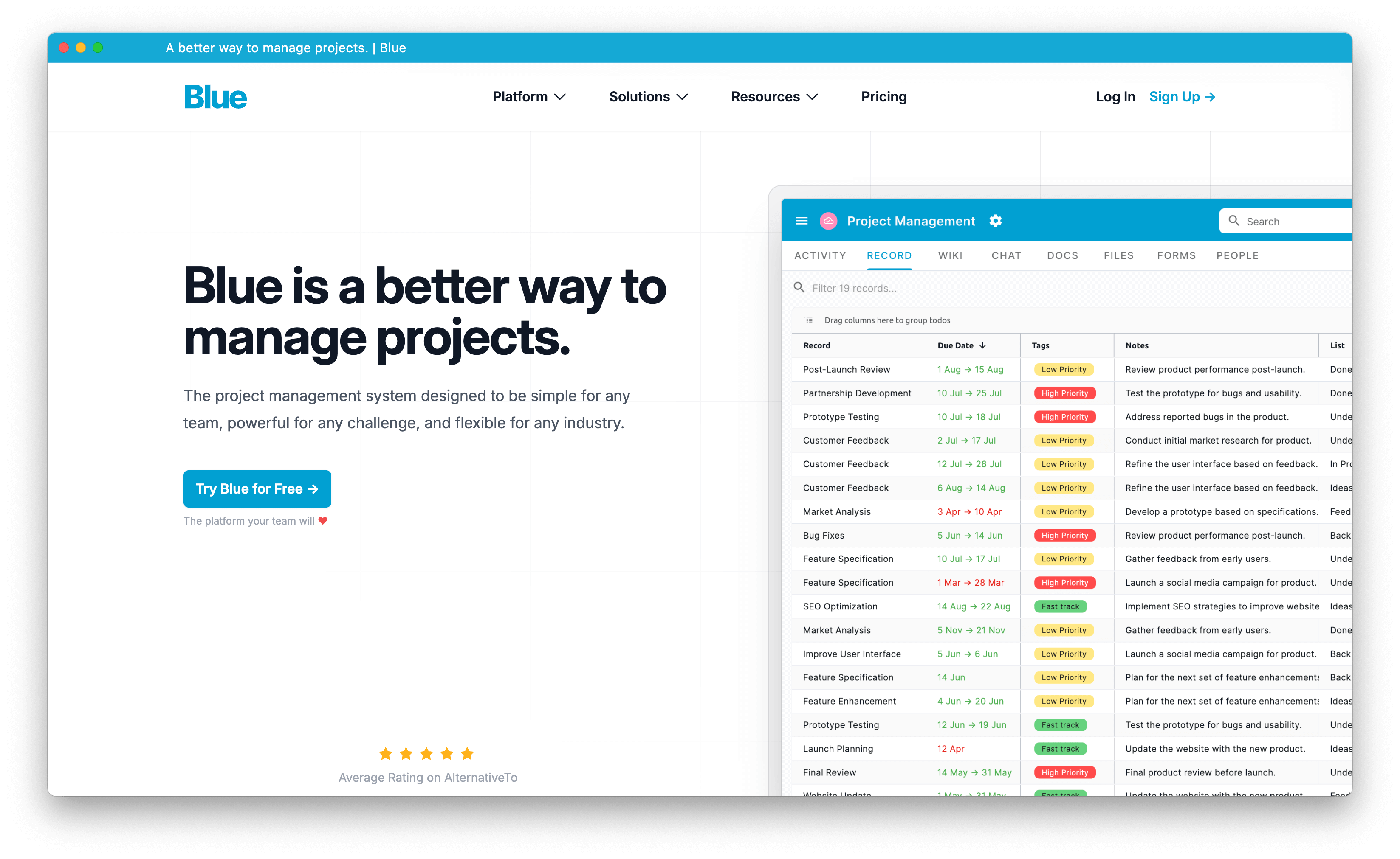
In late 2023, we took our rebranding efforts a step further by introducing a stunning new logo and updating our visual design across all of our applications. This refresh was inspired by our commitment to continuous improvement and our desire to create a brand that is both modern and timeless.
![]()
Our new logo is based on a modified Inter typeface, which was carefully chosen for its clean, sleek lines and exceptional readability. The updated design embodies the simplicity and efficiency of our platform, while also conveying a sense of professionalism and reliability.
In addition to the logo, we also updated the typography across all of our applications to enhance the user experience and improve overall legibility. This change ensures that our platform is not only visually appealing but also easy to navigate and use for extended periods.
Another significant update was the change in language from "todos" to "records." This shift was made to showcase the versatility of our platform and emphasize that Blue goes beyond mere task management. By using the term "records," we highlight the fact that our platform can handle any type of data, making it a comprehensive solution for businesses across various industries.
To further enhance the user experience and provide more valuable information to our user base, we made the decision to move away from Webflow and develop a custom website using Nuxt3 and Vue3.
This new website is highly performant, ensuring that users can access the information they need quickly and efficiently. The custom development also allows us to have greater control over the content and functionality of our site, enabling us to better serve our users and showcase the full capabilities of our platform.
The refreshed visual identity and website have been met with enthusiasm and praise from our user community. We're thrilled to offer a more polished, professional, and user-friendly experience that truly reflects the power and flexibility of Blue.